Language:

Alexa Chung is featured as the main image on this front cover, the shot is a medium shot of her posing which links with her role as a model. This would appeal to many women as Alexa is a fashion icon who is very successful, clever and attractive. Alexa Chung is staring into the camera which makes us think she's addressing us personally and it can give off different ways of how she is presenting herself. The main sell line is 'Alexa Chung's couture adventure' so this makes it obvious her feature in the magazine will be based on fashion. The bold font on the cover all fit the same colour scheme and show the more important parts as opposed to the different font size/coloured font. The reason this is done is because the bold sections are to attract attention and appeal to people more. 'Vogue' is written in the largest font and the 'g' has been covered by the main image, the reason this is acceptable with this specific magazine is because many people already recognise Vogue as the font is the same every month and it's a largely popular fashion magazine. The colour scheme is pink and feminine which links the magazine to women automatically. The date and price has been placed to the top left of the magazine and is much smaller compared to the other text. The reason for this is because they want people to focus more on the other features and not necessarily notice the price.
Ideology:
The ideology of this magazine is mainly based around wealth, fashion and a higher social class. The reason this is so obvious is because the magazine is quite clearly a well-known fashion magazine which is published all around the World. The models are often sophisticated women in expensive clothing which indicates the magazine is aimed at women with large amounts of money who enjoy fashion. The main image is always of a celebrity/model which makes us feel the magazine is genuine and popular.
Institution:
Vogue is an American fashion magazine and it's clear that it's largely successful, this is obvious by the fact they have been publishing since 1892 in America and went on to publish monthly in 23 other countries. The editor of British Vogue is Alexandra Shulman who writes an editors letter in each months publication of Vogue.
Many different brands are published in Vogue and a large amount of the magazine is designer brand's advertisements.
Information found from:
http://en.wikipedia.org/wiki/Vogue_(magazine)
and the Vogue magazines.
Audience:
Vogue is a very upmarket and expensive magazine full of articles about designer clothing therefore the target audience is more likely to be young to middle aged women who have large amounts of money. Vogue is a very popular magazine and so would also appeal to people interested in fashion and as it contains a large amount of advertisements, it could appeal to media/photography students. The people who model for the adverts in Vogue are usually well-known and popular in the modelling industry therefore the magazine is appealing to people who are fans of the specific model.
Representation:
The cover model of this specific issue of Vogue is Alexa Chung who is often linked to the magazine as she's a contributing editor at British Vogue and is well-known for her modelling and fashion. She fits the representation well, is appealing for people interested in fashion and makes the magazine seem trustworthy as she's a very popular celebrity. The colours work well with the clothing that Alexa is wearing as the text is very visible in comparison to her neutral colours.
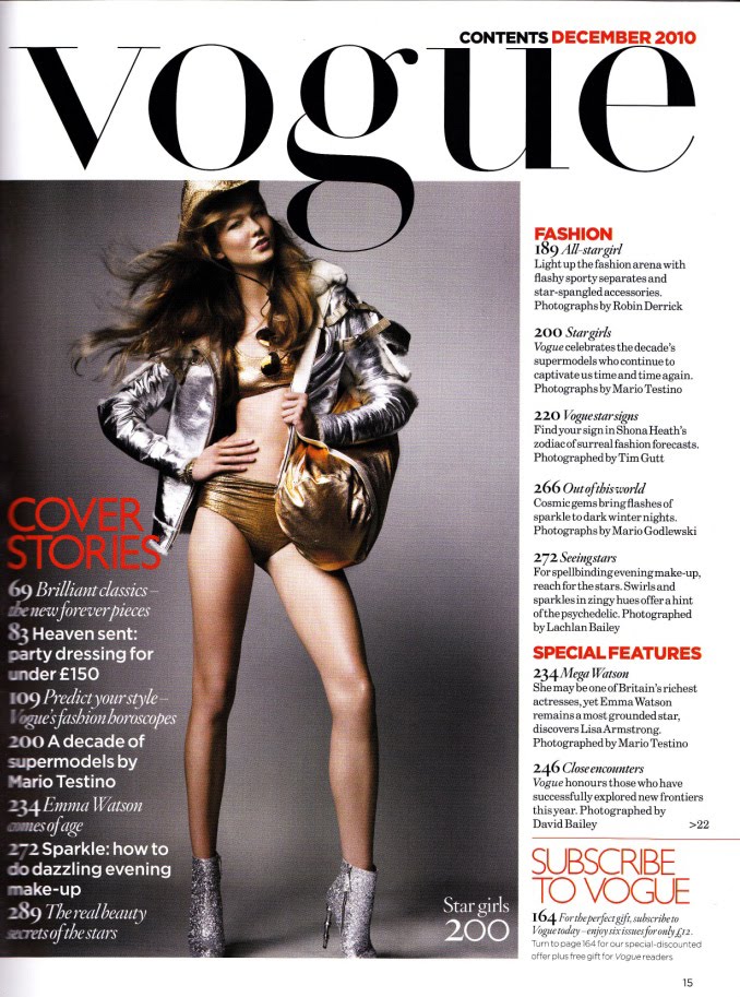
Language:
The masthead to the Vogue contents page fits the similar position of what is on the front cover and is also very bold and visible. We are told that it's a contents page but that isn't as visible as the masthead which gives us the idea that it isn't an important feature of the magazine. A large image is shown of what is likely to be featured inside the magazine which makes the contents page very similar once again to the front cover. A small section of the contents page is dedicated to the cover stories and it shows what page numbers the articles on. Page numbers are an important convention to a contents page as they're needed in order for specific articles/stories to be found easily. Another section shows all the other stories and their page numbers featured in the magazine. At the bottom of the page is a small promotion towards Vogue which says 'Subscribe to Vogue' which would be aimed at people who often buy the magazine.
Ideology:
The main image shown is of a women posing in clothing that is likely to be expensive and in fashion at the time of the publishing for this issue. The clothing is very revealing which can be taken differently by each person. The wealth and social class is clear from this page as the features shown are often for women who can afford expensive clothing.
Institution:
Before a magazine is published it has to go through the editors so they can review specific aspects and see it is up to the standard of what they want. This page would often look similar throughout each month's publishing of Vogue as it isn't a large part of the magazine.
Audience:
Vogue is likely to be aimed at young-middle aged women who are interested in fashion and therefore this page would be appealing and helpful for them to find exactly what they're looking for quickly.
Representation:
The representation is very similar to that of a front cover as the title is large and there is a main image to fit with one of the articles. The colours stand out against the plain background and make reading it a lot easier. The reason an image has been put here is to link into the magazine and explain some of the main features.
Language:
The layout of double page spreads are often very similar and contain an image on one side with a small description and the main story to go alongside it. In this case the story opening is to the left of the page and the main image is on the right but goes slightly over into the left page. Usually an article will only get a double page spread or more if it's a useful or popular topic. Vogue often make double page spreads of the celebrity they have put on the cover and this appeals to many people. The font is quite plain and simple which can mean that the photo takes most of the attention.
Ideology:
This specific article seems to be about what supermodels wear after their workday, so this would be aimed at people who are interested in fashion and how supermodels dress when they aren't having photos taken. Vogue is mainly for higher class women so this article may also be promoting certain clothing styles.
Institution:
Double page spreads are often written by different journalists who work for Vogue and the whole magazine would have been run through the editor before publishing.
Audience:
The audience for the whole of Vogue magazine is young to middle aged women, people interested in fashion and possibly journalism. This page would especially appeal to aspiring journalists as they would study and read carefully through the articles to review the techniques used.
Representation:
A model is shown doing some form of exercise in this image which implies that the article could be about what clothes can be worn whilst relaxing/working out. The photo seems very sophisticated and set in a calm place which gives the effect of relaxation.


No comments:
Post a Comment