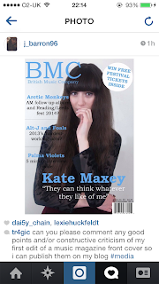
I decided to post my first draft of an indie rock music magazine front cover on the social networking site Instagram. I asked for constructive criticism which could lead to me improving my magazine as getting other peoples' perspectives is always better.
Saturday, 28 December 2013
Sunday, 22 December 2013
First Front Cover Draft
This is my first front cover draft which I created after the research process of music magazines. I went with the many typical magazine front cover conventions as I wanted my first draft to look as professional as possible but still be able to improve and become more adventurous with the layout/font when continuing with a second draft. I chose to go with a simple layout which proved quite effective as my first draft.
The layout of my magazine front cover was chose after various research of other music magazine front covers. I wanted the text to fit around the cover photo so that it wouldn't cover too much of it and therefore I kept to a specific font. Each different piece of text was typed in the same font which was Bookman Old Style as I felt it looked more appropriate and less amateur. The masthead is larger overall with a font of 130 as it needs to stand out and grab attention.
The colour scheme I chose was blue, white and black which I thought was basic but still very effective as it doesn't make the front cover look messy. A fault with the black text is that it is slightly difficult to read when placed over my model's black top and will therefore need to be changed.
Overall, I feel this firsts draft has enabled me to understand how to construct a magazine front cover correctly and will help me go on to develop a second draft.
Tuesday, 17 December 2013
Focus group video: Indie rock
My focus group video is based around indie rock music and was posted on my YouTube page. Emily speaks about her favourite indie rock bands and festivals/gigs/concerts that she has been to/plans to go to including Leeds fest.
Monday, 16 December 2013
These photos are what I took for my first photo shoot with my model, Kate for my indie rock music magazine. Some shots are badly angled and the lighting is reflected badly but I made sure the photo I chose was a flattering angle with good lighting so that my magazine looked as professional as possible. We used varied outfits for some shots but finally settled with a red velvet skirt and a black grunge inspired shirt. I felt that outfit and the makeup (which was black eyeliner and a natural skin tone) used made the photo more effective for the indie rock genre.
Sunday, 15 December 2013
Indie music prezi
I created this indie music prezi to enable me to get ideas across and help inspire my own music magazine.
It contains information such as conventions of a magazine front cover, indie/indie rock bands, album artwork and the reason I chose to do indie rock. This way I felt more confident in how I was making my front cover and why I chose the specific genre.
Saturday, 14 December 2013
Different font ideas
These are my different font ideas which I used from Dafont.com and Microsoft word. I felt that creating a board of varied fonts would help me decide what would look and work better for my front cover.
Friday, 13 December 2013
Digital mock up of front cover, cp and dps
This are four screenshots of all my digital mock ups that I originally made on publisher but then put them onto powerpoint in order to label them.
Page one gives information of what the powerpoint is about.
Page two shows a labelled front cover mock up.
Page three shows a labelled contents page.
Page four shows a labelled double page spread.
Thursday, 12 December 2013
Indie rock clothing ideas
These indie rock clothing ideas were taking from clothing websites such as Topshop.
Dark colours tend to link to rock and therefore that's the main theme of colour for my clothing ideas.
Dark colours tend to link to rock and therefore that's the main theme of colour for my clothing ideas.
Monday, 9 December 2013
Test shots
Close up (bad framing):
This photo is an example of bad framing; it's clear that the camera is tilted and that half of her forehead has been chopped off due to the bad angle.
A posed shot: Posed shots typically show an image of people/a person posing but I personally believe they look too exaggerated.
Medium close up:
This photo is an example of a medium close up. The upper body is visible and she is centred in the middle of the shot.
Two shot:
Two models are placed next to each other in this shot and are shown posing individually.
Group shot: A group shot contains three or more people.
Subscribe to:
Comments (Atom)


